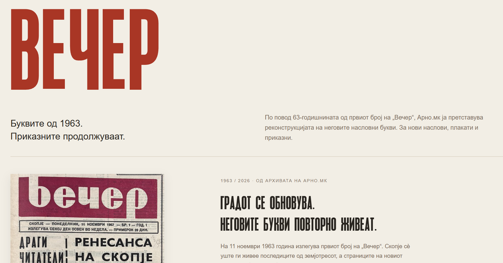
When we archived the first issue of Večer from 1963, we were looking for stories about Skopje. Among reports on new neighbourhoods, building sites and everyday life after the earthquake, our eyes were also drawn to the letters used in some of the headlines. Tall, narrow and striking, they are part of the city’s visual memory. To mark the 63rd anniversary of that first issue, we at Arno.mk have turned these archival traces into a font you can try, download and use in your own stories.
The City Rebuilds, the Newspaper Records It
In the first issue of Večer, dated 11 November 1963, we read about a Skopje trying to re-establish everyday life after the earthquake. Prefabricated housing estates, schools, construction sites, culture, sport and daily needs. The city was rebuilding, and the new newspaper was documenting the process.
A distinctive typographic character also runs through its pages. Narrow, tall, powerful letters. They have something of the immediacy of a newspaper headline—the need to say something in a small space that will catch the eye.
We decided to give them a chance to write again.
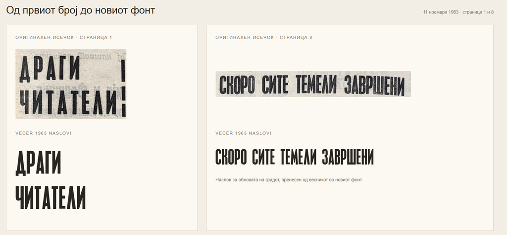
To mark the 63rd anniversary of Večer’s first issue, we present Vecer 1963, a font that grew out of our research into its headlines.
Reading the Shape of a Letter
The work began by isolating and comparing letters from the archival pages. The old printing, the paper, the folds in the newspaper and the quality of the scans had all left their marks. Each letter’s shape needed to be read carefully too: where did its defining character end, and where did damage to the surviving copy begin?
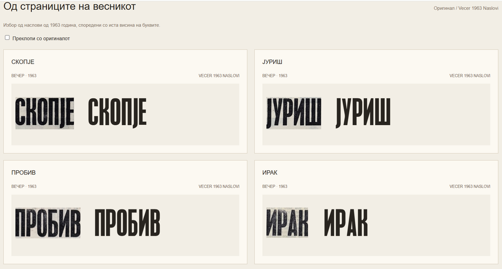
In the reconstruction, we followed the narrow proportions, elongated counters and distinctive joins that give this headline style its recognisable appearance. We compared the digital letters with the original clippings, including by overlaying them directly.
Gradually, those old pages gave rise to a font for use today.
Two Rhythms for New Headlines
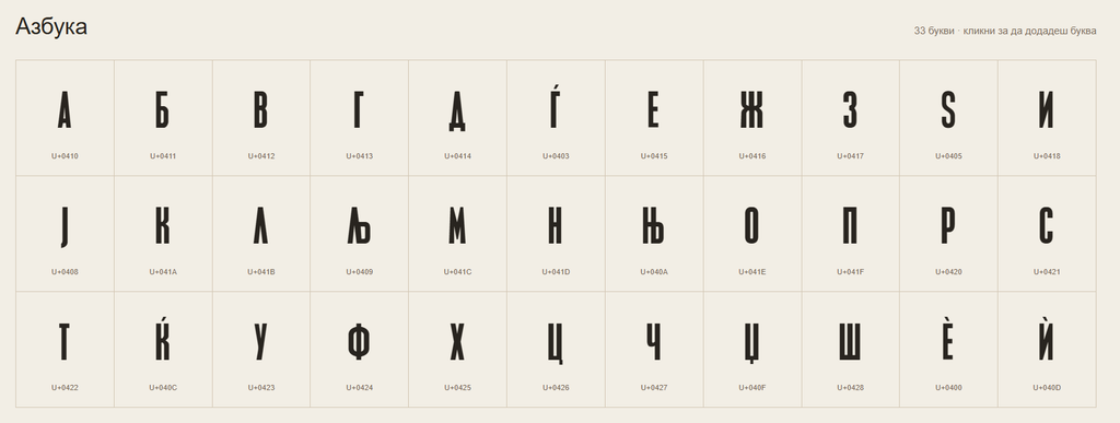
Vecer 1963 comes in two versions. Rekonstrukcija (“Reconstruction”) has tighter letter spacing, while Naslovi (“Headlines”) offers a little more room and a more open rhythm. They are intended for headlines, posters, covers, visual posts and short messages.
The font includes the complete Macedonian alphabet, as well as Ѐ and Ѝ, numerals and punctuation. We have also added a Latin character set with Č, Ć, Š, Ž and Đ. The Latin letters are our own original extension based on the shapes of the reconstructed Cyrillic characters, expanding the font’s use for bilingual and regional content. All letters are capitals, and they also appear as capitals when you type in lowercase.
From an Archival Clipping to Your Next Poster
On the website, you can enter your own text, try both versions, browse the characters and see comparisons with the archival samples. We have also prepared a type specimen, and the fonts are available to download free of charge.
For Arno.mk, this continues our work with archives and collective memory. Reading an old newspaper led to something that can play a part in creating new content. The letters that once spoke of the city’s foundations can now carry your words too.
You can read the story that started it all in “The First Issue of Večer from 1963 and the Birth of a New Skopje”. Or simply download the font. Your choice.